
One of the primary ways that studios advertise for upcoming movies is with posters. They’re traditionally seen in movie theaters, but are now commonly posted online as well. With just a glance, they’re meant to attract attention, give some details about what the movie is about, convey the tone of the film, and persuade folks to want to see the movie. It’s a tall order for just a poster, so it needs to be well designed. Unfortunately, though, there’s a now long-running trend in which studios have been focusing on “floating head” posters for their advertising, and it’s overall a terrible approach.
Floating head posters are ones that just feature character’s heads without giving much detail about the movie, and they’ve become shockingly common. Some examples of these floating head monstrosities are the posters for Dune, Last Night in Soho, The Super Mario Bros. Movie, Avengers: Infinity War, Spider-Man: No Way Home, and to think of it, most MCU movies.


This doesn’t affect the quality of the movies at all, but they definitely don’t advertise them well. Random assortments of characters looking in arbitrary directions doesn’t tell us anything. All it says is that these characters are in this movie. On top of that, while this sometimes leads to a pleasing image to look at, these posters are often quite ugly. Things are placed haphazardly on them, sometimes characters are posed in awkward ways, and there are posters that have certain characters appearing on them multiple times, like one of the posters for Spider-Man: HomeComing. It’s like a middle schooler’s first graphic design project.
Studios who do this are lucky they can afford to get great trailers out there because these posters don’t do much to attract moviegoers to their film. They usually don’t give off any sort of tone or give any details. Plus, they just look lazy and cheap. Who wants to see a movie made by someone who doesn’t put effort into their work?
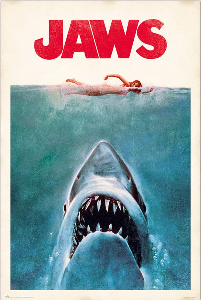
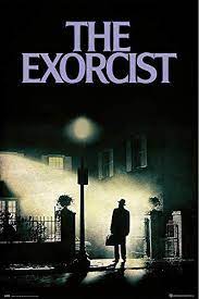
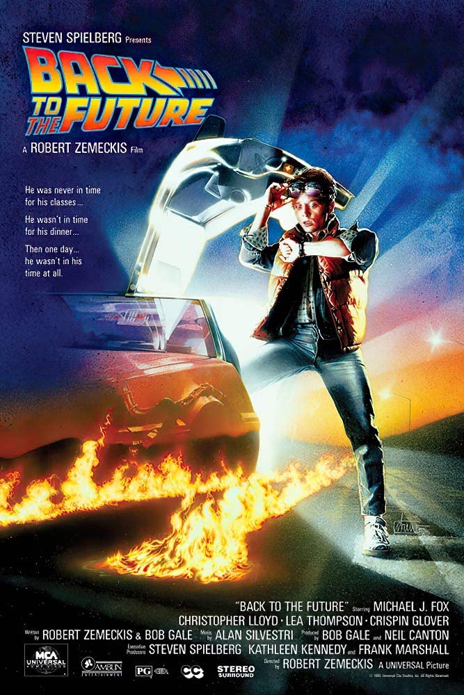
Some of the best movie posters of all time include Jaws, which tells audiences exactly what the film is about just by looking at it, The Exorcist, which highlights the eerie tone of the movie, and Back to the Future, which excels in getting people excited to see the movie. Their designs all work for very different movies. They’re all pleasing to look at without randomly placing pictures of characters around the image.
Hopefully Hollywood can get past the cringeworthy floating head trend with their posters. Perhaps the excellent posters that have been released for Scream 6 is an indication that there is a change on the horizon, and that we may see more posters as great as how they used to be designed.

[…] Read Next: Floating Head Movie Posters Need to Stop […]
LikeLike