Batman is one of the most iconic superheroes of all time and one of the most influential characters in all of fiction. Since the 1930s, the character has resonated with both younger and older audiences. It’s certainly no surprise that there have been so many theatrical iterations of Batman over the years. There have already been a lot of Batman movies, and a brand new one, The Batman, is set to release next year. This is the perfect time to reflect on the previous Batman films (or at least most of them) and their movie posters for this installment of Poster Impressions.
Batman (1989)
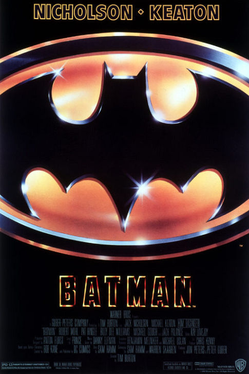
The poster for 1989’s Batman doesn’t exactly advertise much other than that a Batman movie is coming out. It’s just the Bat Symbol. It doesn’t even have Batman on the poster, making it the only Batman movie poster without the titular hero appearing on it. What’s a bit odd about the Bat Symbol, though, is that it’s really shiny for no apparent reason. It’s not shiny in the movie, so why is it sparkling here? Also, it’s kind of hilarious that the Bat Symbol is so large on the poster that they couldn’t fit it in and cut off the sides.
Not showing Batman on this poster is an especially bold move considering this was considered a very different Batman at the time. Previous to this film, people likely would have expected something similar to Adam West’s Batman. Without revealing him on the poster, those particular fans may have been in for a surprise.
The credits on the bottom are useless. They are practically unreadable. Dark blue on a black background was not a smart idea.
Another interesting detail on the poster is that Jack Nicholson is credited before Michael Keaton, despite Michael Keaton being the one playing Batman. Perhaps it was because Nicholson was the more seasoned actor at the time? Either way, it still feels odd.
Batman Returns (1992)
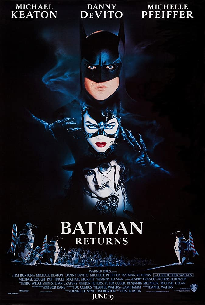
The poster for Batman Returns is pretty strange. It looks like Batman, Catwoman, and the Penguin are stacked on top of each other like the Little Rascals in a trench coat. It’s like they are uncomfortably perched on platforms that are a little too close together as they lean over each other.
This poster definitely shows us that they’re going for dark tones like 1989’s Batman, which is fine and actually really exciting. However, seeing this poster indicating the tone being dark leads to a weird contrast with the goofy penguins strapped to fireworks on the bottom. Is this movie dark? Is it silly? The real answer here is simply Tim Burton.
The smoke from the Penguin’s cigarette is covering their faces, but also lighting them up to stand out from the dark background. It appears that the smoke is somehow illuminating the poster. Obviously, that’s not something smoke like that can do.
This is overall a good poster because it showcases who the main characters will be from the source material people already love. Moviegoers seeing Catwoman and the Penguin making brand new live-action appearances is truly exciting, especially before our modern age of comic book movies ruling the box office.
Batman Forever (1995)
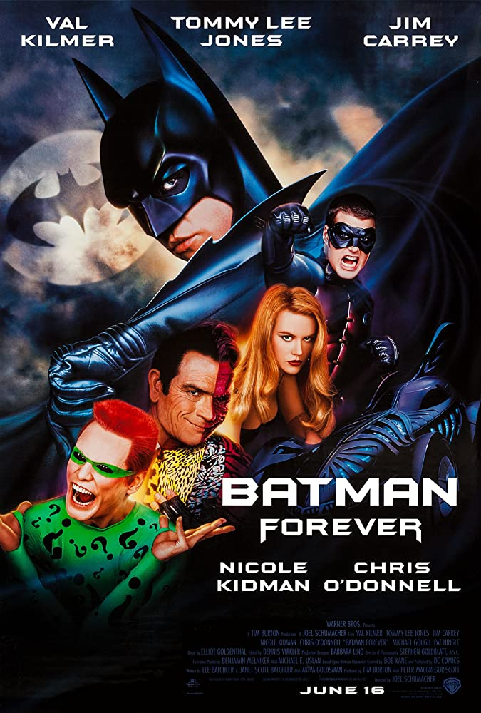
This is actually a pretty good poster. It shows us the main cast, and it’s clear who they’re all playing. It’s also evident that the tone is a mixture between dark and silly, whereas that wasn’t very clear with the previous two movie posters. They’ve managed to find a way to portray the darkness while also retaining bright colors.
Jim Carrey’s arms are bent into such an unnatural pose. Even with trying to portray a questioning pose (since he’s the Riddler), it’s too much. His arms almost look broken.
Two-Face’s double face could be a little more clear. If a casual moviegoer saw him on this poster, they may think that Tommy Lee Jones just has something on his face, or that the lighting isn’t quite right on him. Jones being Two-Face must have also thrown off moviegoers, considering Harvey Dent was played by Billy Dee Williams a couple of movies ago and he’s now been race-swapped.
An odd, yet kind of fun detai is that Batman’s arm in the top half of the poster clearly resembles the Batmobile in the bottom half. It’s goofy, but a neat aesthetic choice. This is also the rare occasion where the Batmobile is featured on a movie poster.
Batman & Robin (1997)
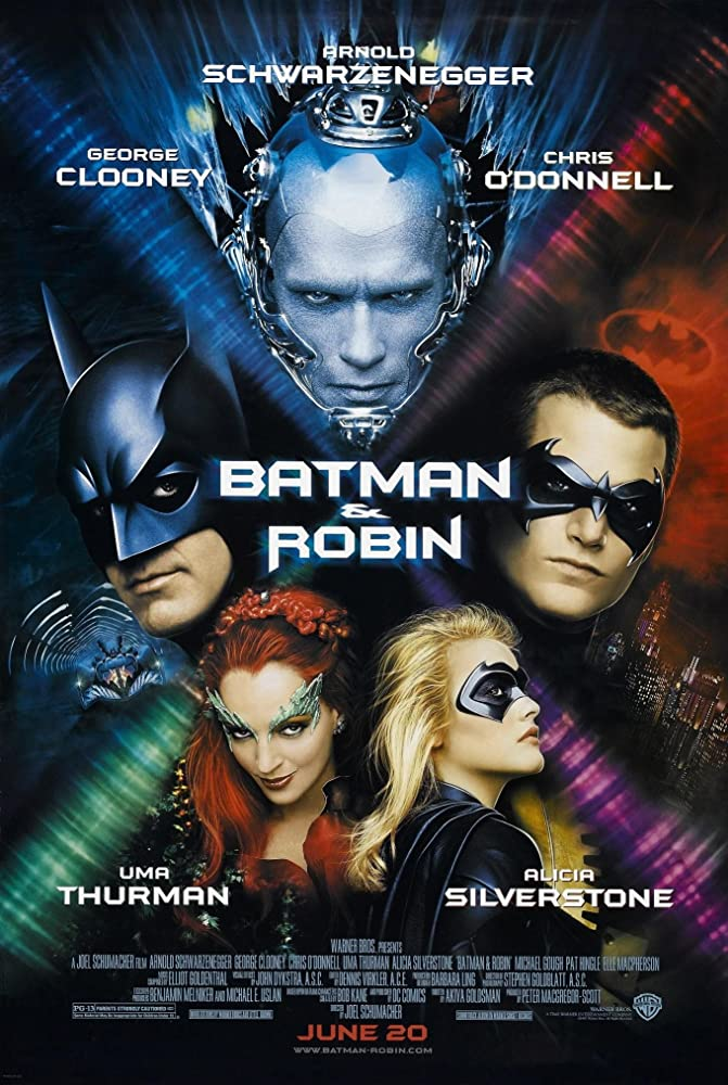
You like these Batman characters? Well, here are their faces! Similar to the Batman Forever poster, it’s evident who the main actors are and who they are each playing. Fans of Poison Ivy and Mr. Freeze were bound to be excited by this. Strangely enough, though, Bane is noticeably absent despite also being a villain featured in the film.
Interestingly, Robin’s quadrant of the poster features the Bat Signal, not Batman’s. It probably would have made more sense if those backgrounds were switched around. In Batman’s quadrant, it’s tough to tell which vehicle is shown. Upon zooming in, it’s the Batmobile viewed from the front. However, it looks a little more like the Bat Wing (another vehicle seen in the movie) at this angle.
Mr. Freeze’s quadrant of the poster is pretty COOL to say the least. The ice aesthetic surrounding it provides a fun visual. It is a bit strange, though, that Mr. Freeze is front and center instead of Batman. Who’s movie is it again?
Why do Poison Ivy and Batgirl share their quadrant? They aren’t a team in the movie. They barely have any interaction at all. Is it just because they are the female characters? If so, that’s a bizarre and sexist reason to shove them together on the poster as if they are the dynamic duo of the story.
Batman Begins (2005)
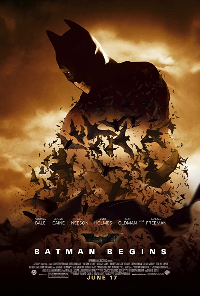
Is Batman made out of actual bats? This poster sure makes it seem like Batman is literally made out of bats. Joking aside, this is actually a really cool visual. It adds a sense of mystery to Batman’s character.
The poster barely tells us anything other than there is a new Batman movie coming to theaters and that this isn’t related to the Burton/Shumacher films. That’s not necessarily a bad thing, especially since the title Batman Begins tells us everything we need to know.
The lighting and color scheme is interesting as well. It looks a little more like an old-school film with this color palette. It overall looks like the movie would have a more serious tone than previous Batman films.
The Dark Knight (2008)
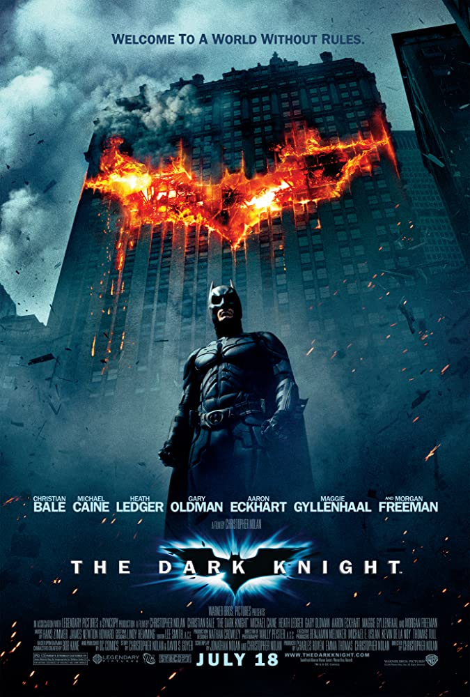
“Batman’s back and he’s here to blow stuff up!” With the explosion being in the shape of the Bat Symbol, it makes Batman seem pretty suspicious. Is he blowing up buildings now? Plus, a giant flaming Bat Symbol isn’t exactly stealthy. This is something Batman would absolutely never do, but it’s also the coolest-looking Batman movie poster. It sacrifices an accurate portrayal of the character for a badass aesthetic, and it honestly pays off.
Unlike most of the previous Batman movie posters, we actually get to see his full Bat-suit in all its military-grade glory. Again, not exactly “Master of Stealth,” but it’s worth it to see how awesome the character looks. It’s a great “action hero” shot.
“Welcome to a World Without Rules” is an intriguing tagline. It gives off Joker vibes without actually having him on the poster. It’s also an idea that represents the perfect opposite of Batman since he is all about justice and order. That one tagline showcases the exact kind of conflict Batman will have to deal with during the film.
The Dark Knight Rises (2012)
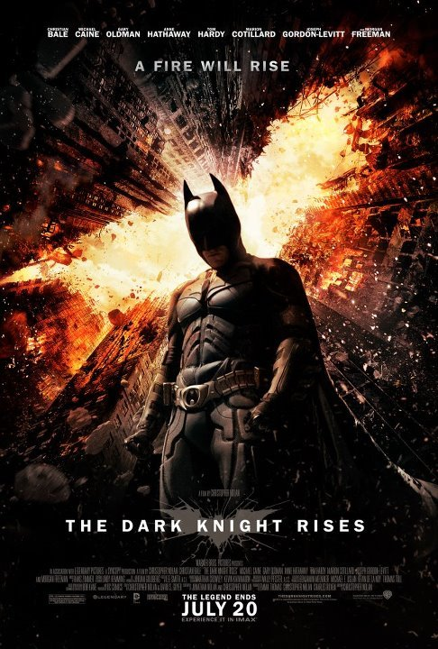
How is Batman standing perpendicular to the buildings in the background? It’s like he’s standing on a wall. He never uses any sort of gravity boots in the movie, so this logic makes no sense. Batman is one of the best superheroes ever, but he doesn’t have the ability to defy the laws of physics, especially in a version like this that’s grounded in reality. Also, it’s difficult to tell if the top of every building is exploding or if the sky above them is just bright orange. That being said, the Gotham City skyscrapers forming the Bat Symbol is a neat idea.
“A Fire Will Rise” is another interesting tagline, but it’s not as obvious as the one for The Dark Knight. It looks like there is a literal fire rising in the background, but this probably means something a little more figurative. It could indicate Bane and his movement rising, the fire within Bruce rising, Batman rising to the occasion, or Bruce literally rising out of a hole like in the movie. It’s likely not that last one, even though the Dark Knight LITERALLY rises out of a hole in the film, which is a little silly. The fact that this could mean so many things is intriguing enough to pull in any viewer.
The logo on the bottom also catches the eye, as it’s the Bat Symbol formed out of what appears to be cracked glass. On one hand, this could be because Batman enjoys crashing through windows quite frequently. On the other, it probably hints to Bruce being literally and figuratively broken in the film.
Batman v Superman: Dawn of Justice (2016)
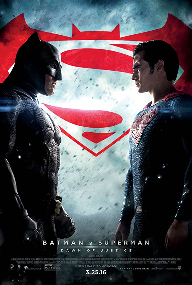
The poster for Batman v Superman: Dawn of Justice showcases exactly what it needs to. It’s literally Batman versing Superman. Two of the greatest heroes in comic book history facing off in a big-budget, action-packed blockbuster is a perfect popcorn-seller. Obviously the poster doesn’t indicate much else, like why they’re fighting, but they look ready for battle. Despite the film not being as successful critically or financially as the studio may have wanted, this poster is more than enough to excite any moviegoer.
The Bat-Super Symbol is really cool, but it makes it so the Bat Symbol is weirdly thick on its own. They could have just used a smaller Superman crest so it provides the same result without making either of them appear weird on their own. That being said, that logo is a fun way to advertise the first big-screen meeting of Batman and Superman.
It’s not quite clear what’s going on in the background. Is it hailing? Are rocks falling from the sky? Is ash flying around the air, indicating something burning or exploding? It’s a great aesthetic piece, and it prevents the background from being too empty, but it’s not quite clear as to what is actually happening.
The line separating the title and subtitle brings attention to how contradictory they are. How can there be Batman v Superman AND The Dawn of Justice? We now know that they fight and then work together in the film, but the title indicates two very different plots for the film. That line separating them just brings attention to the fact that these two ideas are very separate from each other.
The Lego Batman Movie (2017)
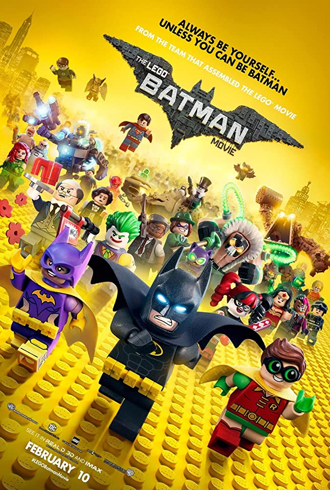
There’s a lot going on here. First off, it clearly showcases what this movie is: It’s Batman made out of Legos. That sounds like pure fun and enjoyment. Robin and Batgirl running alongside him show us that he’ll have his team this time around, which he doesn’t always have in movies.
A stampede of other characters, primarily Batman’s enemies, run behind Batman and his team. This reveals that tons of his enemies will be featured in the movie. Any Batman fan would be excited to see the likes of Bane, Riddler, Mr. Freeze, Clayface, Poison Ivy, and the rest in a movie together. It also, unfortunately, might mean that there could be too much going on for one film. After seeing the film, it does seem odd that characters with major parts, like Alfed, Joker, and Harley, are mixed in with characters who only get a few or no lines at all like the Flash, Manbat, and Blight. It does make the poster a fun “who can you spot?” game of popular and obscure Batman characters.
There’s no reason for the image on the poster to be crooked. It might be to make it seem like it’s wacky or zany enough to keep your kid distracted for a couple hours, or to show their Lego feet can hold on to those pegs even when the floor shifts sideways. Either way, it just makes me tilt my head when searching for my favorite villains.
Among the many Lego DC characters running toward the screen is Two-Face. This version of Two-Face is particularly interesting, as he is voiced by and designed to look like Billy Dee Williams. Williams played Harvey Dent in 1989’s Batman, but the role was recast for Batman Forever when the character actually becomes Two-Face. Williams getting the chance to play Harvey as Two-Face is a fantastic meta-joke and reference.
“Black and Yellow” may be a theme for the movie, but using all this yellow in this manner looks like a yellow haze has fallen over Gotham, which looks a bit odd. There are other ways of representing all the black and yellow without it being too much like it is here.
The tagline reads “Always be yourself… unless you can be Batman,” which is almost as humorous as the first hundred times people saw it on a t-shirt or in a meme. It’s also a weird message for kids. It’s like saying “Always be yourself… except not all the time.”
“From the team that assembled The Lego Movie” is brilliant. For one, The Lego Movie was so good that most fans would want to see another movie made by that team. Also, the use of “Assembled” is a great play on words. It’s a fun way to take the cliché movie advertisement line and add a Lego spin to it.
There are a few other Batman movies I could cover the posters for, but I will likely give my impressions of them once the poster for The Batman is revealed. It seems like there will never be an end to great Batman movies, and I say bring them on!
